Where Hospitality Meets Sustainability
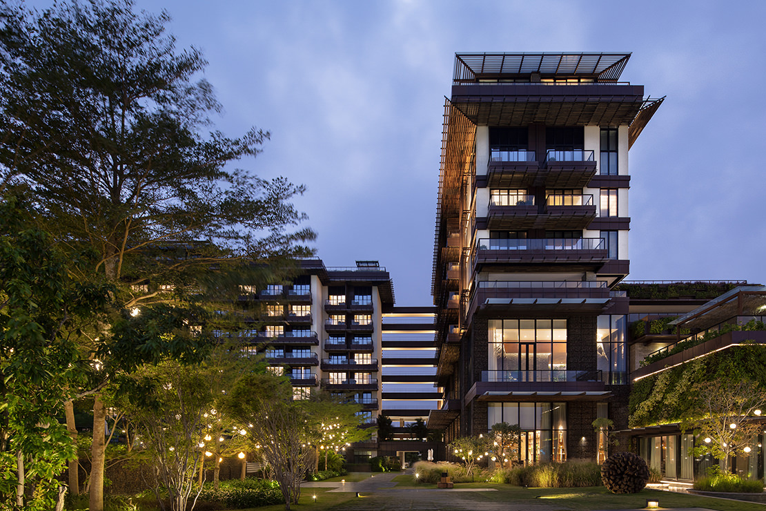
The design of 1 Hotel Haitang Bay privileges environment and guest experience, combining creative sustainability initiatives with a unique home-away-from-home ambience
Recent years have seen hotels and the travel industry take a more customer-centric approach in their services and products. While the traditional sun, beach and city experiences remain popular and widespread, a new generation of consumers has sparked a greater interest in nature-based explorations and story-driven destination experiences.
These consumers are typically conscious of their own health and concerned about environmental and sustainable development issues; they seek meaning in their travels with the expectation and desire to engage with communities that share their values. Deep ecological and cultural tourism has a competitive advantage in the rise of this new wave of tourism: it organically integrates unique sustainable cultural experiences with local characteristics and a refreshed hotel management philosophy.
1 Hotel Haitang Bay is one example of a property that strives to meet the needs of these conscious travellers, and this approach informed the entirety of our design process.
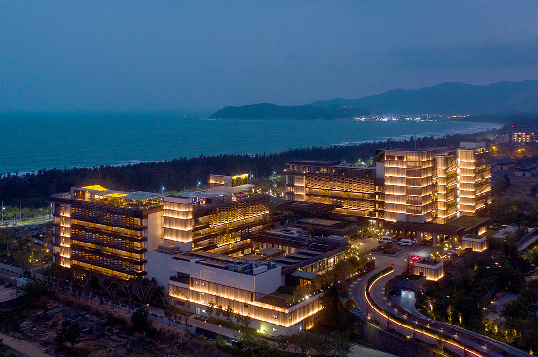
Situated in the picturesque Haitang Bay, overlooking Wuzhizhou Island and the vast South China Sea, 1 Hotel Haitang Bay sits on 10 hectares of land, with the main hotel offering close to 300 guest rooms. Our brief was to redesign the previously drafted plans and the partially constructed building to align with the brand positioning and management requirements of the newly introduced 1 Hotels, a brand operated by US company SH Hotels & Resorts.
Over the course of designing the hotel, our main challenge was to meet 1 Hotels' requirements in the context of the existing partial structure: the brand aimed to create a contemporary, comfortable, natural and open environment full of textures, while the existing architecture had stereotypically Southeast Asian and Balinese tropical aesthetics, which differed significantly from the hotel's positioning.
Beginning in 2015, our design team created a new concept and design over five years, with the hotel opening in early 2020. Gratifyingly, the project has now become a popular travel destination in Haitang Bay, garnering multiple awards and accolades including the prestigious Forbes Travel Guide Star Award in 2022 and being included in the Top 20 Hotels in China category of the 2023 Readers' Choice Awards by Condé Nast Traveler.
Transforming the Plan
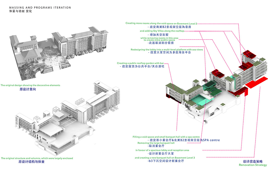
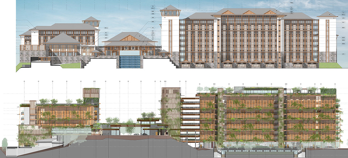
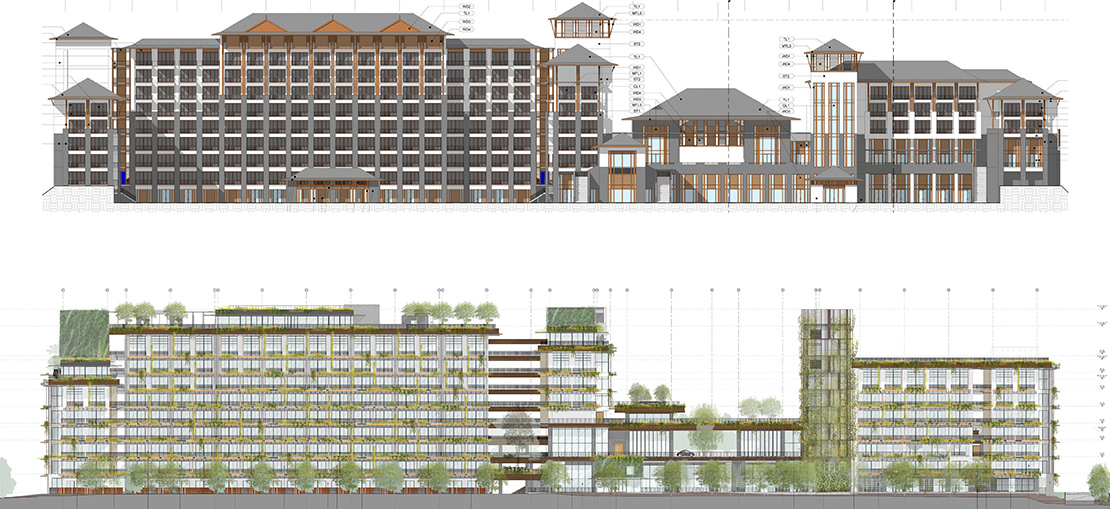
As we evaluated the previous design using 1 Hotels' criteria, it became clear that the spaces were too enclosed, missing the opportunity to create a connection with the picturesque natural environment. The design didn't maximise the three-dimensional volumes in the large space, which resulted in a lack of experiential richness. We wanted to reimagine the design in a way that maximised the environment and the available space, as well as removing the overly stylised tropical elements (Images 3–5).
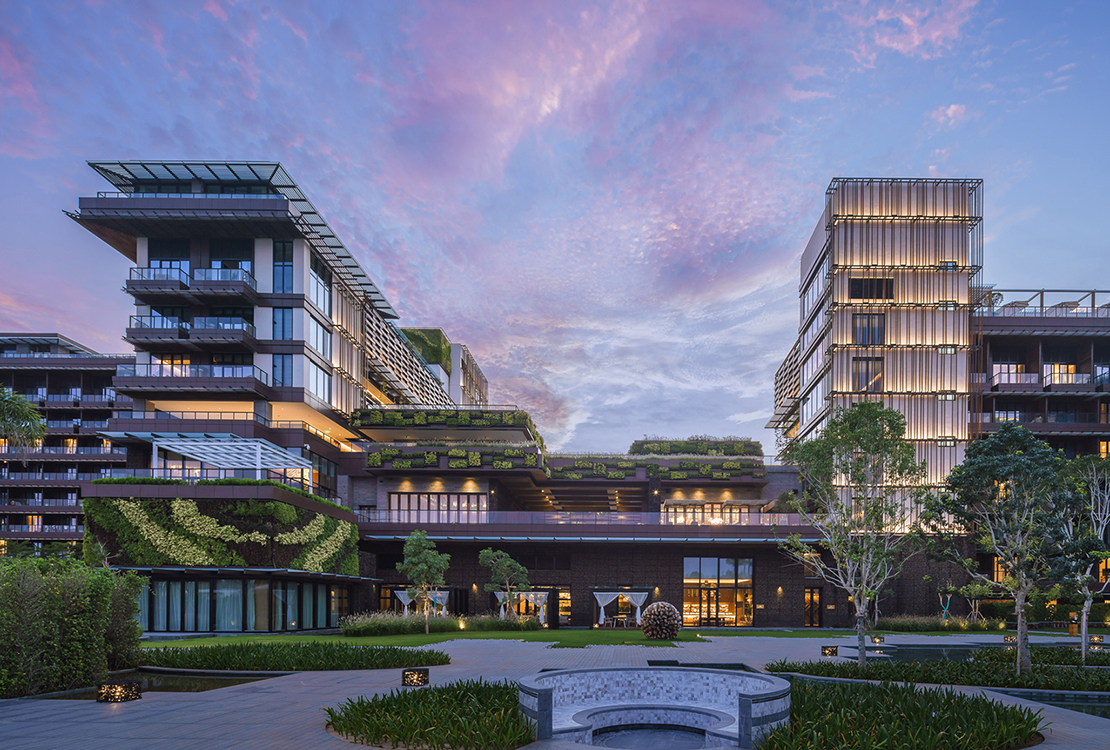
First, we addressed the building volume and facades. We opened up the facade to avoid having a wall effect that shielded the east and west sides from the surrounding environment; this created semi-open void spaces that provide shade and natural ventilation. We removed the large sloping roofs and tropical decorative elements, making way for multi-level gardens and rooftop terraces that open up the space and offer an unobstructed green landscape in all directions. We enriched internal spaces with natural elements such as shaded semi-open corridors and pocket gardens. Similarly, we created a more open, airy and visually unobstructed lobby by transforming the original basic linear area into multi-level sea-view garden terraces.
To further optimise the space and integrate the guest rooms, we removed guest rooms located at the main building's connection points and replaced them with an aerial corridor to create a sense of space that's bright, airy and light. We removed villas that were originally in the main courtyard east of the hotel to open up the space, incorporating some of the villas' functionalities into the rooms, now all positioned on the skyline roof with a more open view and enhanced privacy. Also on the roof are three rooftop villas equipped with unique 'sky gardens', providing guests with a panoramic experience that enriches the architecture with a type of 'fifth facade' beyond the walls.
When it came to food and beverage, we aimed to enhance the interface between F&B outlets with the natural environment, especially with the outdoor courtyard. Our first step was to increase the architectural interconnectivity between restaurant entrances, interior spaces and other areas. In the northernmost wing, we created an outdoor sky lounge, the Sky Bar, to further maximise the connection with the environment.
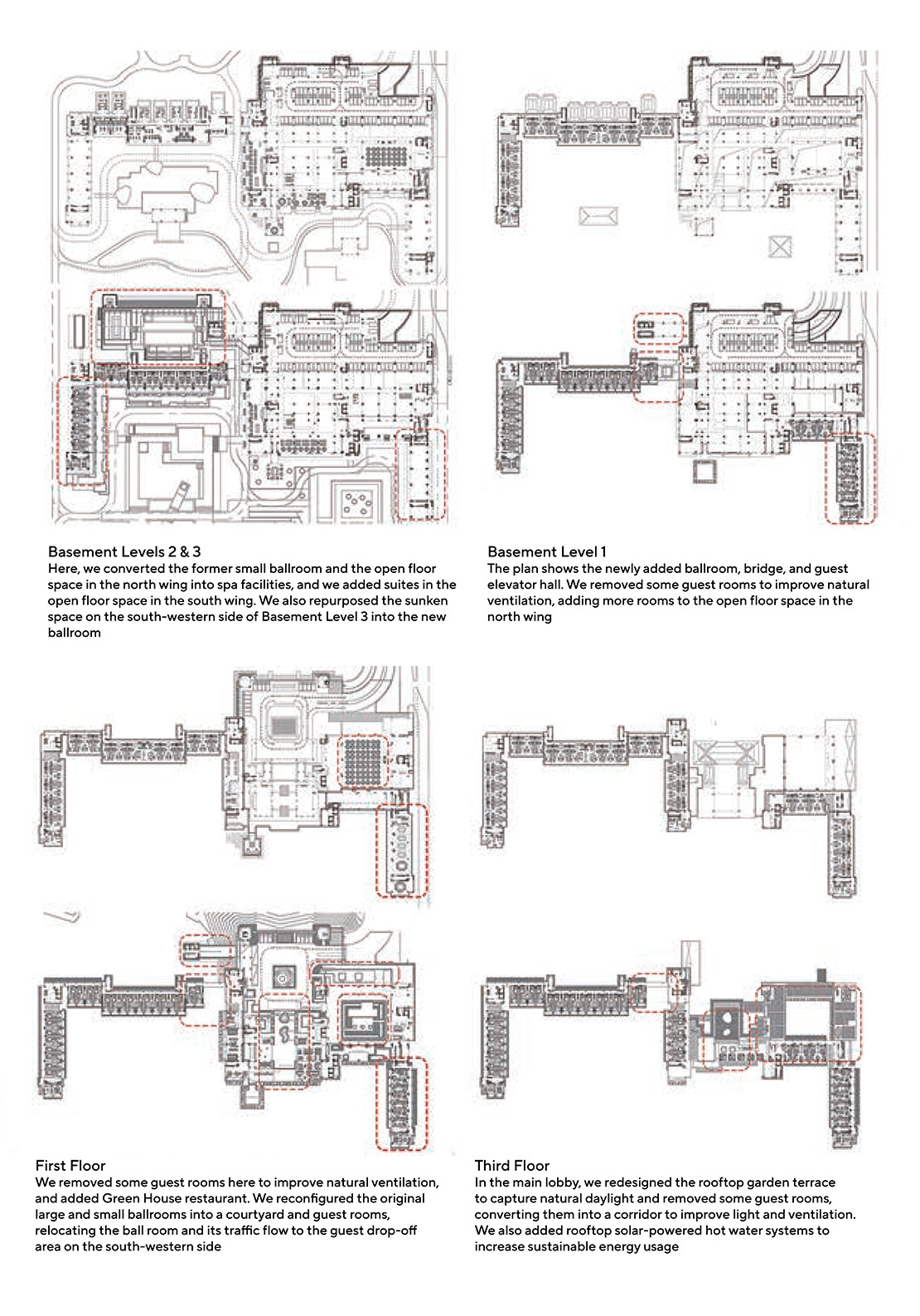
Events spaces were another consideration in the transformation. To reduce the overall volume of the hotel, we removed the original ballroom north of the lobby, instead creating a sunken space on the south-western side of the site to accommodate the new ballroom and conference rooms, which are connected to the hotel's drop-off area while being separated from the lobby with a bridge structure. In the former ballroom, we created a spacious quadrangle that naturally transitions to the lobby; to the west is Green House restaurant, creating a harmonious flow into the spa zone.
The hotel's positioning and guest experience also demanded clearly defined, tranquil zones for leisure and wellness. With this in mind, we expanded the scale of the existing leisure and wellness centre and the leisure and wellness spaces within and connecting to the guest rooms. We also enhanced the interface of the courtyard with the building to encourage indoor-outdoor interactions, and increased the number of private spa treatment rooms to offer a variety of indoor and outdoor spa therapy experiences. The spa centre has a dedicated lobby and hotel elevators, as well as efficient back-of-house logistical flow connecting the laundry room and staff facilities.
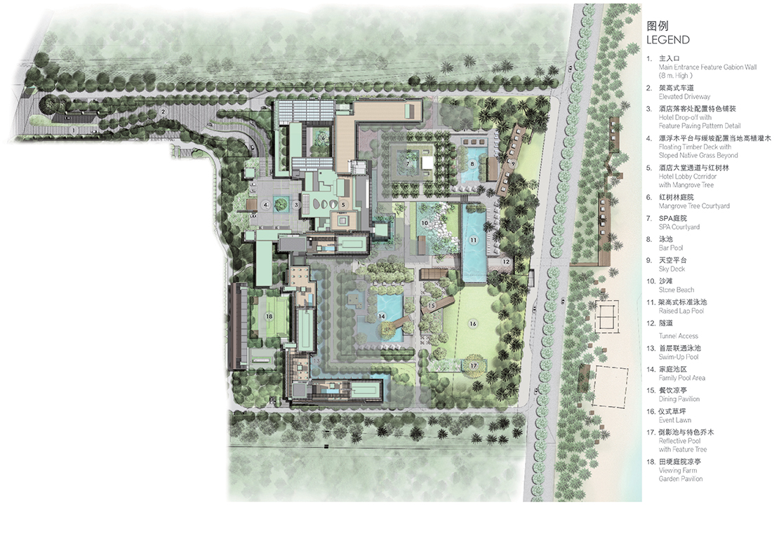
Finally, we diversified the swimming pool and its facilities, which now include a family pool in the south wing; pools closely connected to guest rooms on the ground floor; and a spectacular and impressive rooftop pool. The swimming pools, which are expected to generate noise, are now located away from the tranquil spa area.
Designing for Sustainability
Of course, creating a sustainable destination was paramount. But what does this mean in a practical sense? As well as being mindfully eco-friendly in general, we hoped to create home-away-from-home experiences that would be comfortable in the tropical climate of Sanya. And in a globalised world with many homogenised experienced, the project needed a sense of place: thus, a major focus for us was on how to integrate sustainable global awareness with a profound understanding of the locale. Our design was rooted in the characteristics of the island — its raw and rugged beauty — and drew inspiration from local traditional architecture and craft, geographical features, island culture and landscapes. But this was not the whole solution.
The answer was to make full use of passive architectural design techniques. This achieved the ecological, energy-saving effects we wanted while also embedding locality. Here, the traditional spatial wisdom lies in the clever application of passive architectural strategies to achieve insulation, shading, ventilation, lighting and the use of natural materials. We integrated these local principles into our design to create a tropical spatial aesthetic that harmonises with the island way of life: abundant shading, semi-open spaces, handcrafted textures of local materials and a landscaped architectural vernacular, all of which are inspired by local architecture without becoming a pastiche (Image 6).
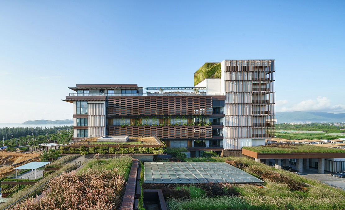
When creating a passive design, the 'layering' strategy is one method of reorganising and reconstructing the traditions of tropical building. For example, screen-like materials or textiles can create a 'loose structure' of layered spatial interfaces, forming walls that can be selectively penetrated by the wind, light, plants and views.
Within this approach, different materials create textures, such as sun-shading metal mesh that reveals traces of time; ventilated wooden brick lattice screens; breathable stone gabion (a kind of metal basket or cage) walls filled with local volcanic lava stone; wooden lattice eaves; and permeable green walls. These loose and layered structures further blur the boundaries between interior and exterior, creating a spatial experience that's both tactile and captivating, with an interplay of light and shadow that enhances the poetic and tropical experience. The layered design also addresses the different life cycles of materials and structures, making maintenance and refurbishments easier and lower in environmental impact.
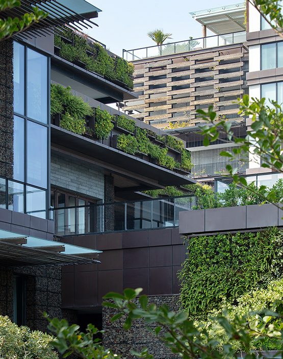
The layered design also helped us to form our '100 Gardens' landscape concept, combining the multi-level terrace-like architecture to produce lush scenes with varying heights and boundaries (Image 7). The materials for the layers come from sustainably managed forests and controlled sources, such as the cypress panels on the facades, which are certified by the Programme for the Endorsement of Forest Certification. The green roof and gardens serve as high-performance surfaces for heat retention, insulation and rainwater utilisation, with a total coverage of several thousand square metres. Local plants such as banyan trees and ferns are scattered throughout the courtyards, green walls and terraces, contributing to three-dimensional biodiversity and further enhancing heat retention, insulation and water retention capabilities.
In order to maximise the use of natural resources and minimise carbon emissions, we employed an array of green technologies in the building, including on-site rainwater collection and utilisation, greywater for irrigation, solar thermal collectors covering an area of almost 1,000 square metres, and environmentally friendly building
The nearby Sunshine 18 Degrees (阳光18度) is the hotel's hidden destination and exclusive tropical farm, with over 10,000 square metres dedicated to the cultivation of healthy organic greens and poultry farming, providing seasonal agricultural produce for the hotel's farm-to-table dining concept. Green living is within reach thanks to the hotel's interior design, decoration and layout, with various details of sustainable lifestyle such as key cards made from reclaimed wood, biodegradable laundry bags, and recyclable cork coasters.
Moreover, from the perspective of environmental comfort, the transformation highlights the relationship between built form and comfort level, particularly with regard to the environmental diversity the design provides and its correlation with the improved comfort level of outdoor spaces. The original layout has been broken down and reconstructed, resulting in increased spatial richness, varied scales and greater flexibility. When lines of sight, natural ventilation and light, greenery and other elements are opened up, the freedom of space allows guests to feel at ease and relaxed.
Creating the Key Elements
With our transformed plan and sustainable approach in mind, we moved into the specifics of some of the hotel's key elements, including the western facade and corridor, which faces the mountains; the eastern facade and balconies, which face the sea; the gabion walls; and the lobby.
The original design featured an open corridor that measured 240 metres long, primarily facing west towards the scenic mountain landscapes. This was a promising idea; however, the walking experience was overly monotonous, and the facade lacked variation and texture. The design didn't fully account for challenges such as exposure to the sun from the west and rainwater entering the corridor.
We reimagined the corridor in several ways. First, we designed shading that would provide protection from rain while maintaining the views and allowing for natural ventilation. We incorporated pockets of green space along the corridor, and installed horizontally projecting pergolas for the planting of shade-providing plants.
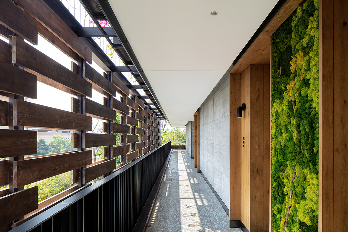
Embracing the natural beauty of the mountain and river landscapes on the western side of the buildings, the design creates a semi-transparent effect on the exterior facade of the corridor that's reminiscent of the lattice walls in traditional local houses. It blurs the boundaries between inside and outside, showcasing playful and intriguing patterns of light and shadow throughout the day. And its layered, floral-patterned wooden grilles and 'flower walls' with climbing plants open up the corridor for an improved sense of experience (Images 8 & 9).

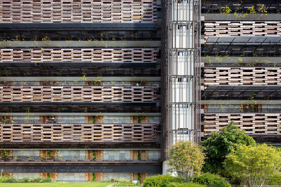
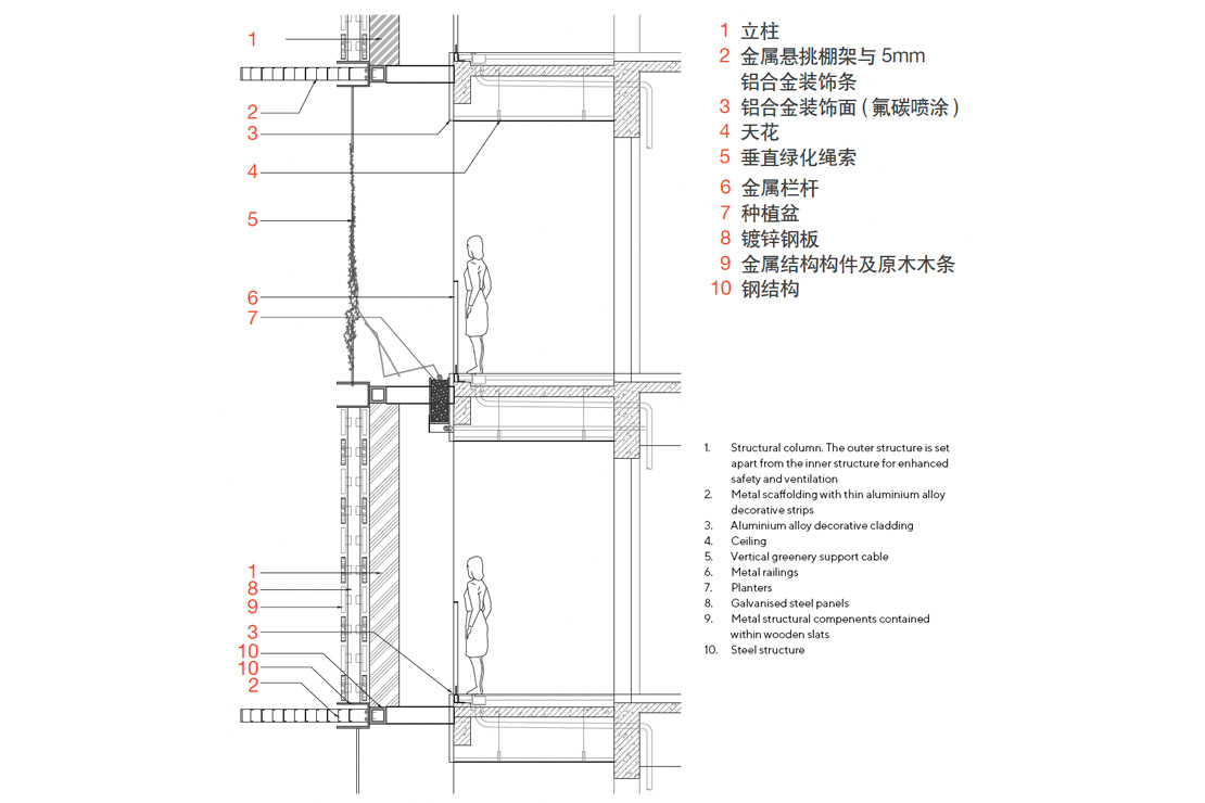
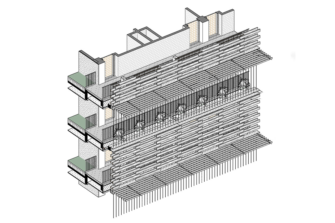
The inspiration behind the wooden grille wall comes from traditional local lattice windows that provide both shade and ventilation. The grilles are constructed using double-layered sandwiched wood panels, with a small gap between the front and back layers that provides ventilation as well as light and shadow. Structural galvanised steel fixings are cleverly concealed within. The wall is detached from the main building and approximately one metre away from the corridor, which ensures safety and facilitates the formation of a vertical ventilation pathway between the wall and the corridor, while providing shade and ventilation as well as protection against rainwater (Images 10-13).
Taking Hainan Island's climate into account, the corridor also incorporates an overlapping arrangement of cedar that resembles a textile mesh. To this we added climbing plants to form natural light and shadow effects, as well as to provide effective shading. The plants on the building facade are thriving, and have achieved the desired effect of alternating wooden and green walls. The walking experience is enriched by the changing patterns of light and shadow, and the highlights of occasional pocket gardens.
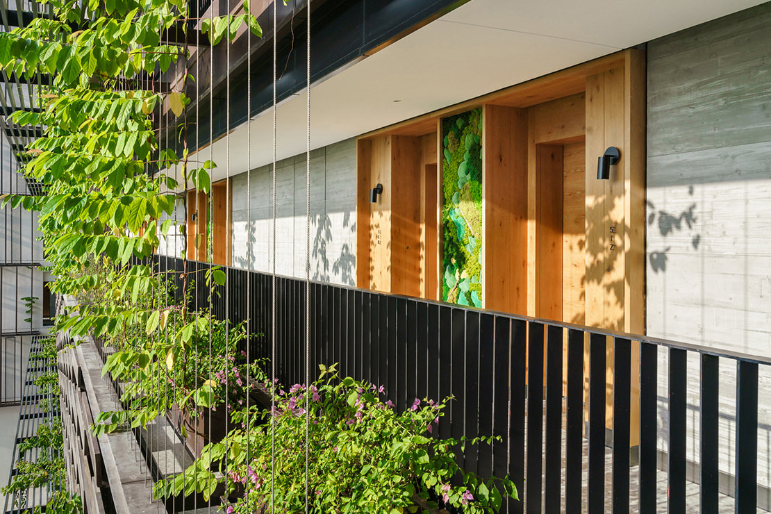

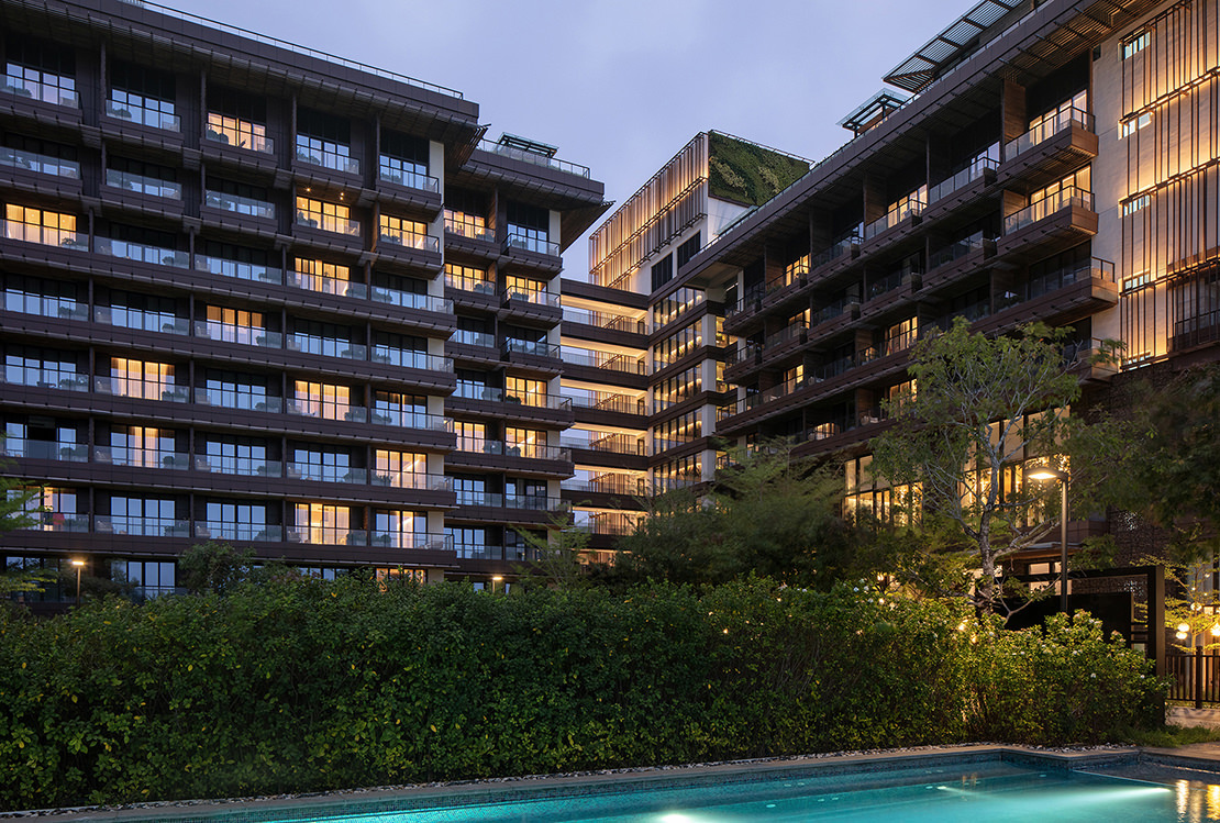
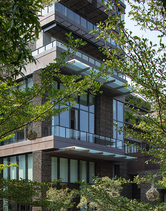
In contrast, the eastern side of the building faces the vast South China Sea and features guest rooms with balconies. Our design aims to create similarities between the eastern and western facades while also forming design contrasts between the sea and the mountains. If the mountain-facing side represents a strong sense of shade, then the seaside facade embodies an openness with gentle sea breeze and clean lines stretching over the long coastline and its dense protective forests (Images 14 & 15).
The design strives to create concise yet rich patterns of light and shadow through clear horizontal lines, while merging warm shades of colours with natural materials. The ceiling of each balcony is designed as an overhang from the facade, not only providing shade from the intense sunlight but also creating highlights and layers of bright horizontal lines against the backdrop of the balcony's dark shadows. The continuity of the bottom-level balconies gradually breaks away to give a sense of rhythm and liveliness. Wooden elements also appear on the surface of the balcony partitions.
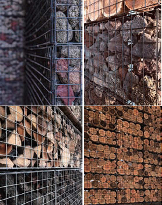
The gabion walls refer to the wall construction of the island's traditional houses, which often use a special material derived from local lava stones to present a natural, rustic and rich texture. Here, our aim was to enhance the overall impact of the building by incorporating rough and solid gabion walls, presenting a landscape texture that's truly local. The team organised on-site wall construction to confirm the effect of full gabion walls through comparing the natural defects of various gabion wall material samples, primarily their outdoor fire resistance and anti-corrosion properties.
Through multiple rounds of on-site sampling and colour matching, we created a colour scheme of primarily grey with accents of red and brown, with the main material being small local lava stones; we installed the gabions as a full curtain wall that provides protection from the elements without being load-bearing, with some sections reaching two storeys high. This approach not only preserves the charm of traditional architecture but goes beyond to present a new aesthetic that incorporates local elements.
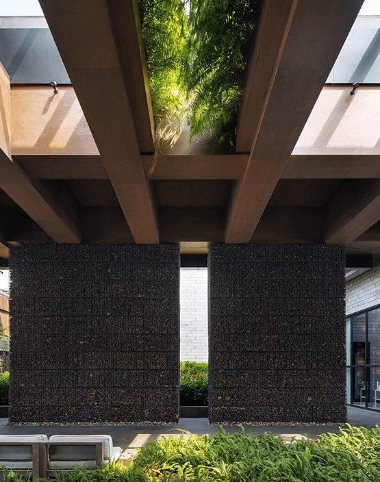
The gabion walls are dispersed throughout the hotel, including the walls on both sides of the entrance lobby; the exterior walls of the east garden restaurant; the low dividing walls between guest rooms and the swimming pool on the south side; and the enclosure at the bottom of the vertical staircase (Images 16-19). The gaps between the lava stone and mesh may in future be home to small local plants, adding to the overall sense of green.
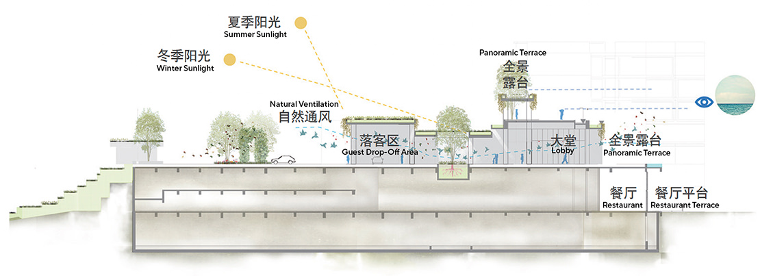
The lobby, as with many resorts in Sanya, creates a sense of arrival through semi-open spaces. This spatial treatment provides ventilation, shading, visual transparency to the surrounding landscape and a welcoming atmosphere. However, we aimed to go further with the use of the space and its surroundings. When entering the drop-off area, guests are met with a naturally curved and gently ascending tree-lined driveway, flanked by textured gabion walls and lush vegetation. In contrast to the surrounding tall and more complex structures, our redesign of this semi-open area adopts a simplified approach to achieve a clean spatial image. It emphasises the human-scaled, horizontal insertion of the entrance and significantly reduces the original scale of the building (Image 20).
The drop-off area is set over two levels, the upper of which features a spacious rooftop terrace and recreational area where guests can enjoy the sea breeze and a panoramic view of the ocean. The greenery on the rooftop extends to the outer sides of the building's horizontal beams. Visitors can also ascend from the lobby's upper terrace to a higher rooftop area. Both rooftop platforms are connected to guest room corridors. Situated at an elevation of 22 metres, the courtyard and spaces on the three above-ground levels are adorned with plants and flooded with light to create the feeling of taking a stroll on the ground floor.
The lava stone gabion walls are symmetrically arranged on both sides of the drop-off area, framing the distant coastal scenery and entrance to the rooms. Subtle natural light is drawn into the area from the rooftop terrace. More lava stones, these with a smoother finish, are used on the walls and columns of the functional rooms behind. The ceiling features rugged wooden structures and suspended vegetation, while the ground is embellished with low yet dynamic and natural vegetation, emphasising the growth of local pine species (Image 19).
To further enhance the relaxed atmosphere and spatial hierarchy, the other side of one gabion wall at the drop-off area is not only home to the reception area and lobby lounge, but also features 'courtyards within courtyards' of varying sizes. These interwoven semi-outdoor areas create more open and permeable public spaces and vistas that blend with the surrounding landscape. They also connect or separate various functional areas of the hotel, guiding visitors to the main elevator halls of the east and west wings, various restaurants and the spa area. Here, we also repositioned the entrances to the hotel's ballroom and meeting and events area so as to avoid conference visitors and regular guests crossing paths. Instead, we set up a prominent and spacious bridge and lobby elevator hall slightly away from the lobby drop-off area on the south side, which allows event guests to directly make their way down to the sunken ballroom and garden.
Conclusion
Our redesign of 1 Hotel Haitang Bay Sanya involved significant changes to the existing concept, transforming its positioning, functional layout and spatial design to align with the brand's direction and a more sustainable tourism model. This included creating ecological and environmentally friendly spatial experiences; fostering interactions among visitors with shared values; and promoting sustainable cultural creativity and consumption patterns.
Additionally, we believe 1 Hotel offers a unique landmark and a change in the discussion for the highly concentrated hotel community in Sanya. Our design vision is rooted in a simple yet powerful goal: to create unique, sustainable and inspiring new experiences that redefine the 21st-centuary concept of hospitality and its culture. As brand founder Barry Sternlicht says, '1Hotels is not just a hotel, but a way of life — a platform that triggers lifestyle changes.'
Images 1, 7, 10: Photographed by Terrence ZHANG
Images 2, 6, 9, 11, 15-17, 19: Photographed by XIA Zhi
All other images are provided by the Oval partnership, Local Collaborating Architect and Hotel Owner.

